

Description
SPECIFICATIONS
Brand Name: opovzoe
Origin: US(Origin)
Hign-concerned Chemical: None
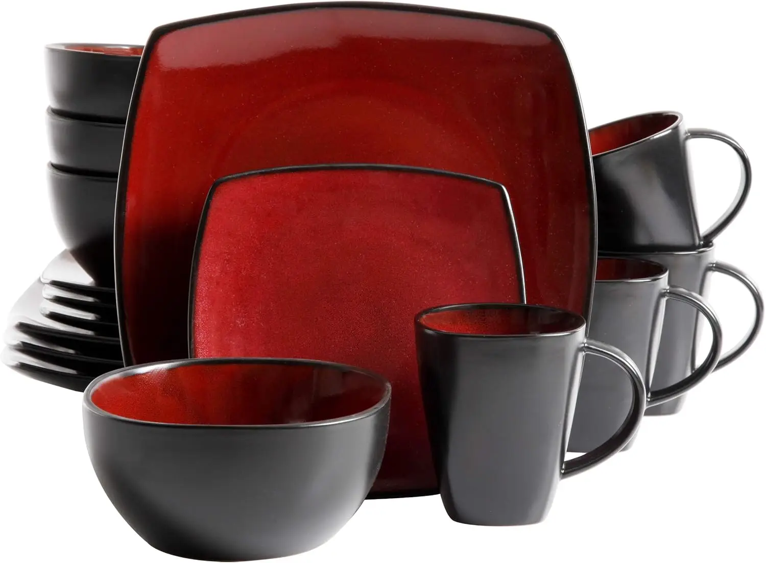
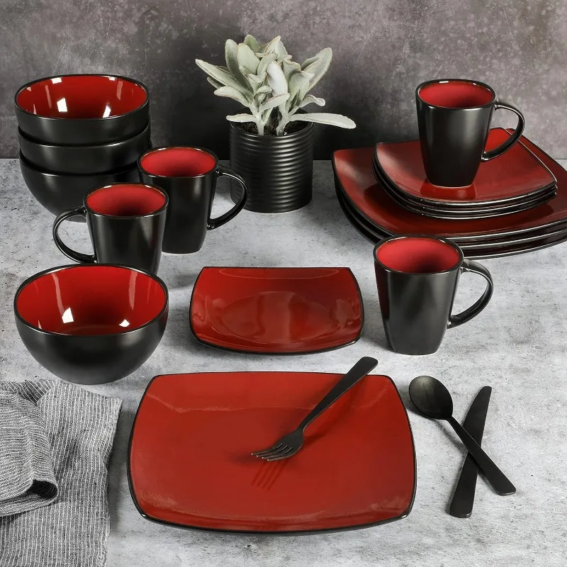
| Color | Red |
| Brand | |
| Pattern | Dinnerware Set |
| Collection Name | Soho Lounge |
| Item Weight | 23.5 Pounds |
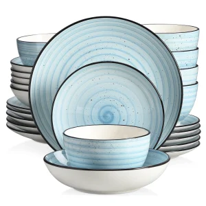
About this item
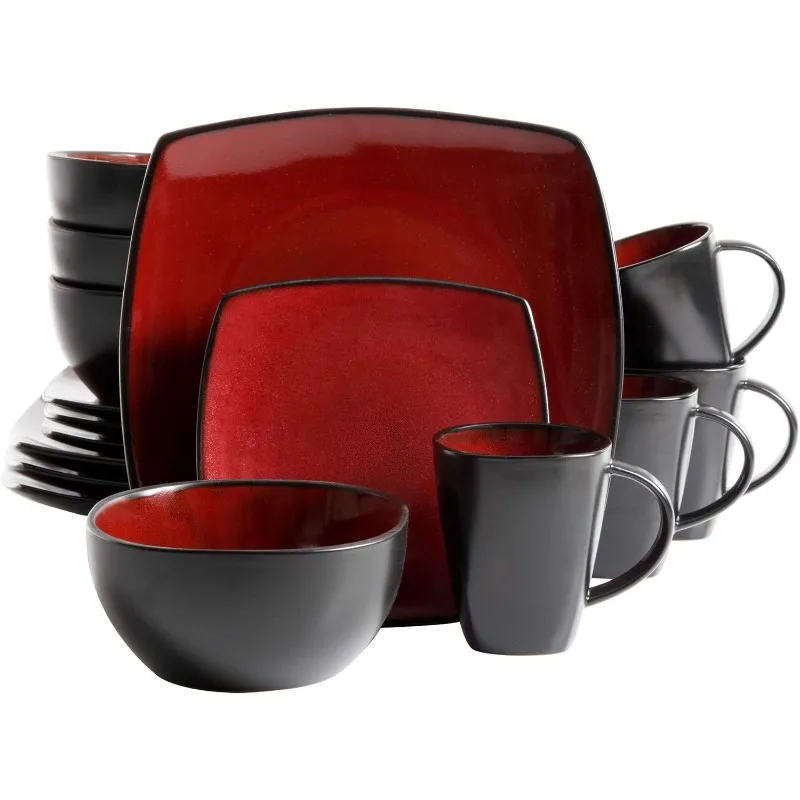
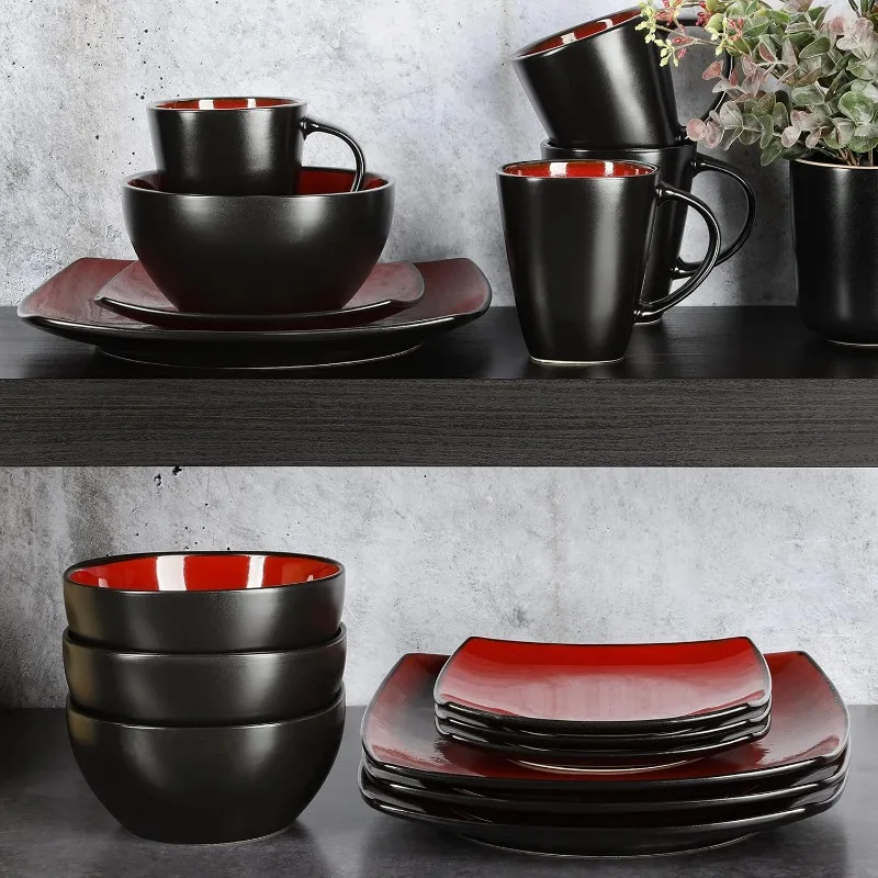
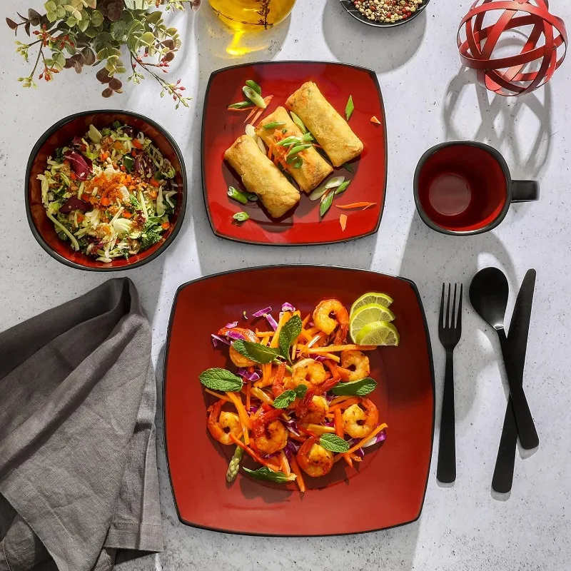
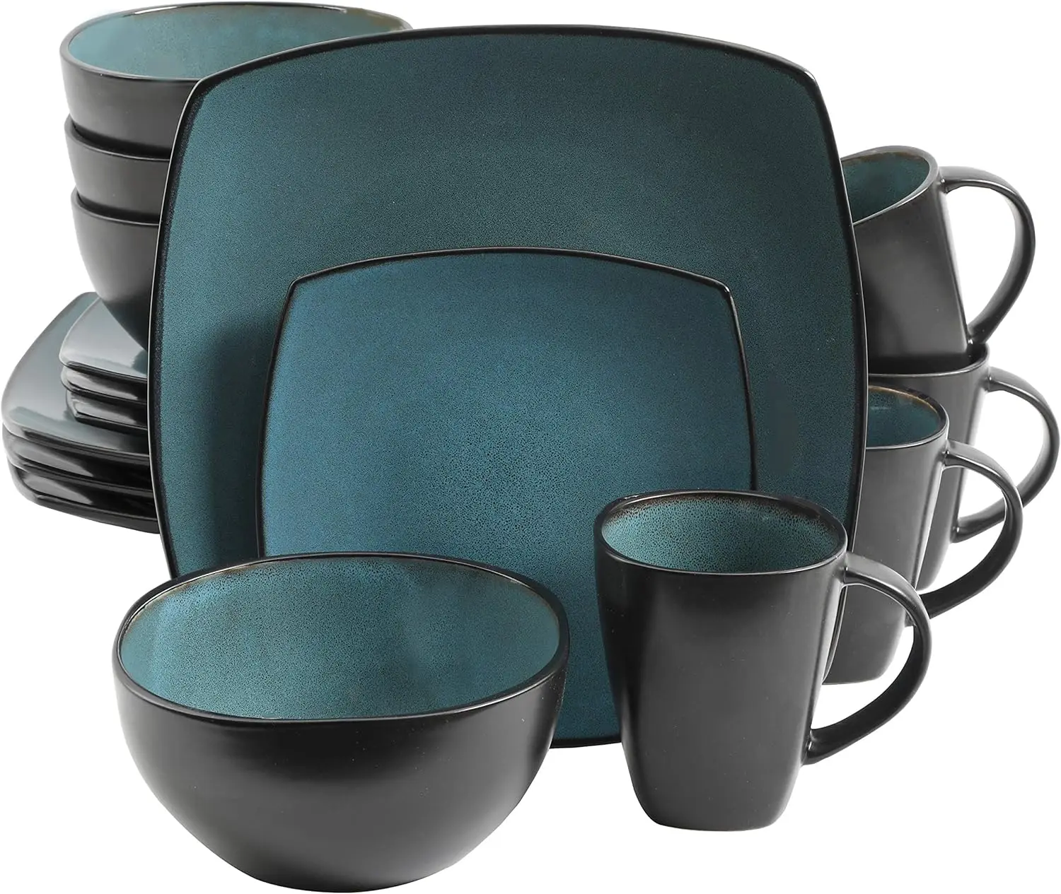
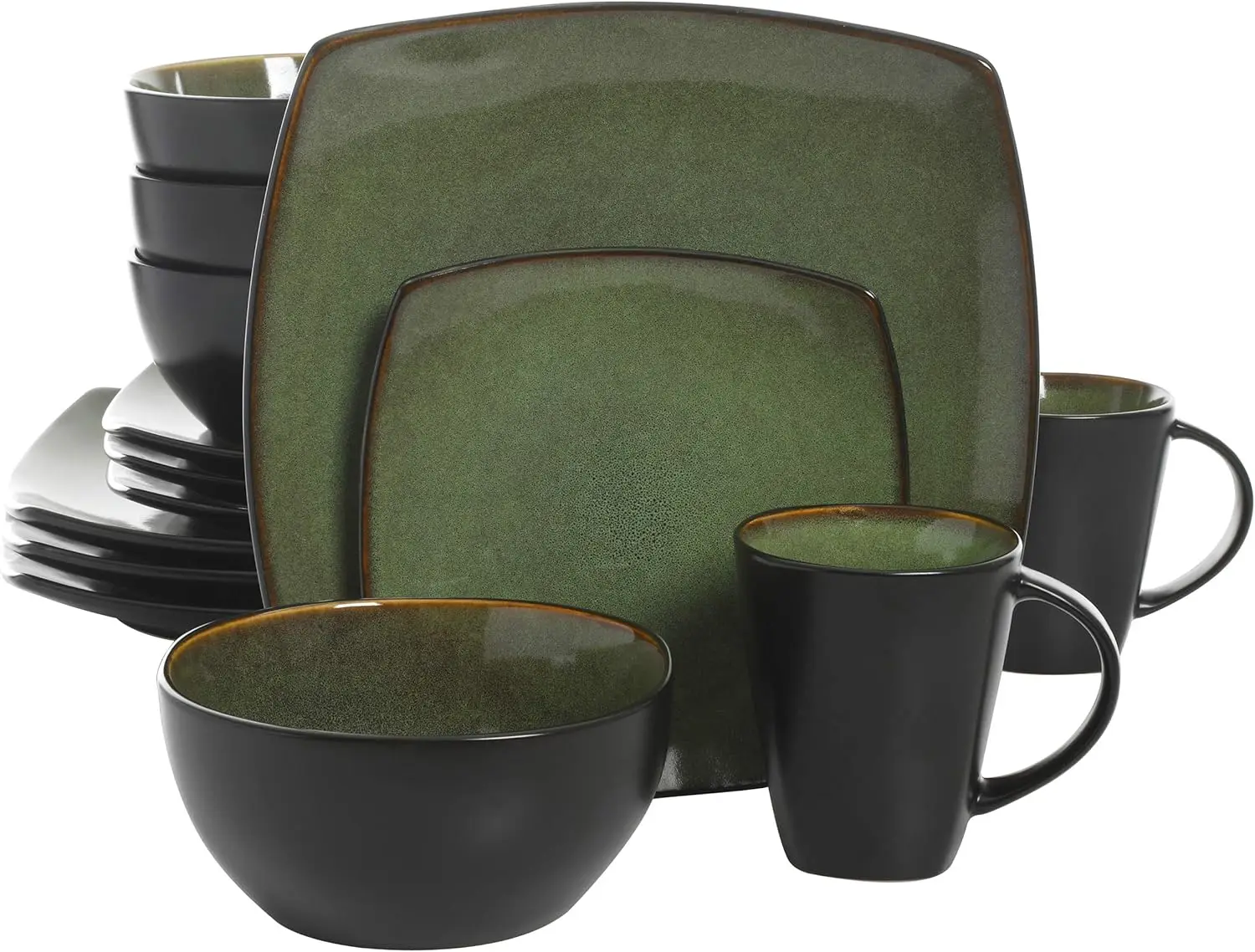
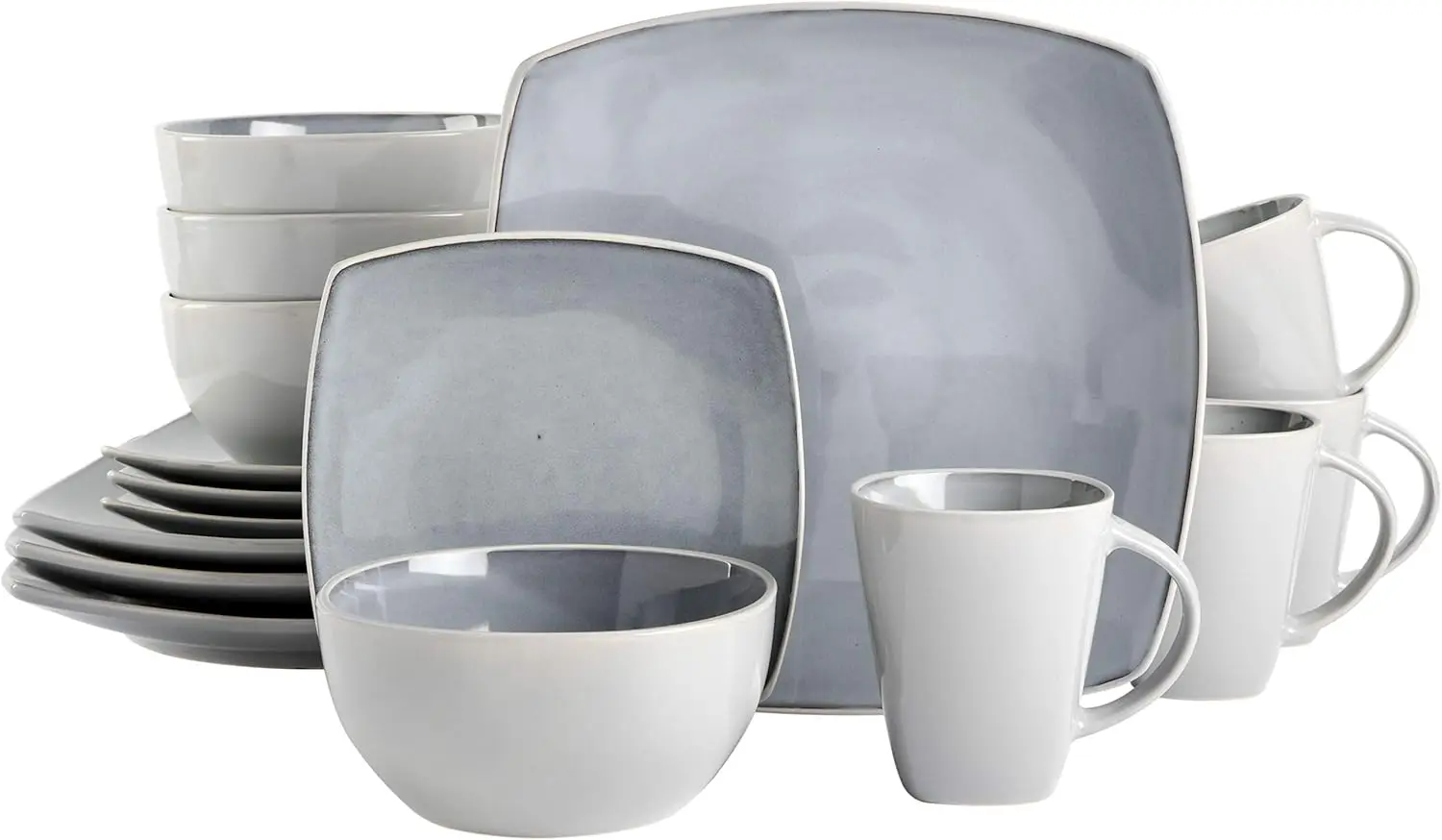
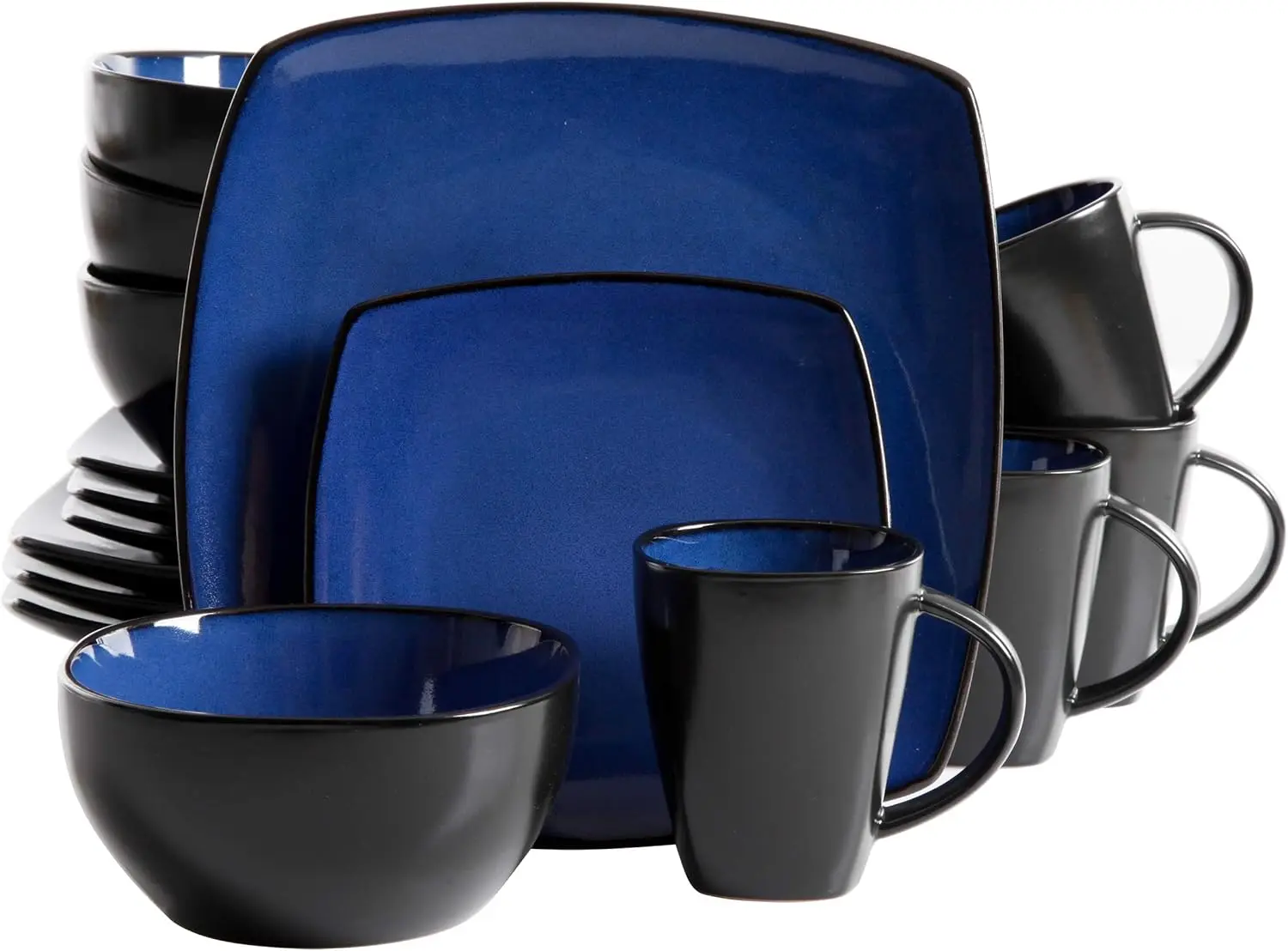
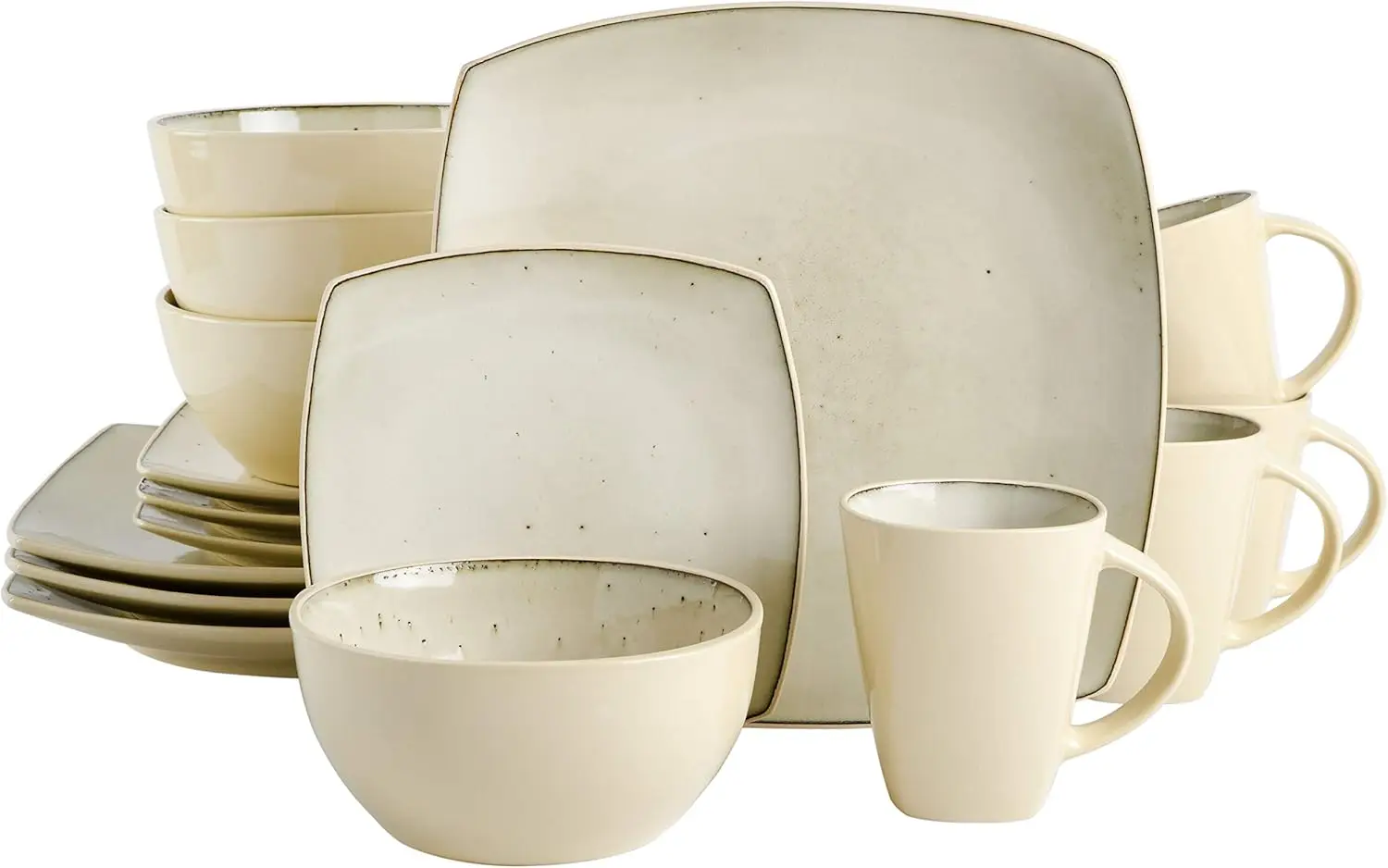
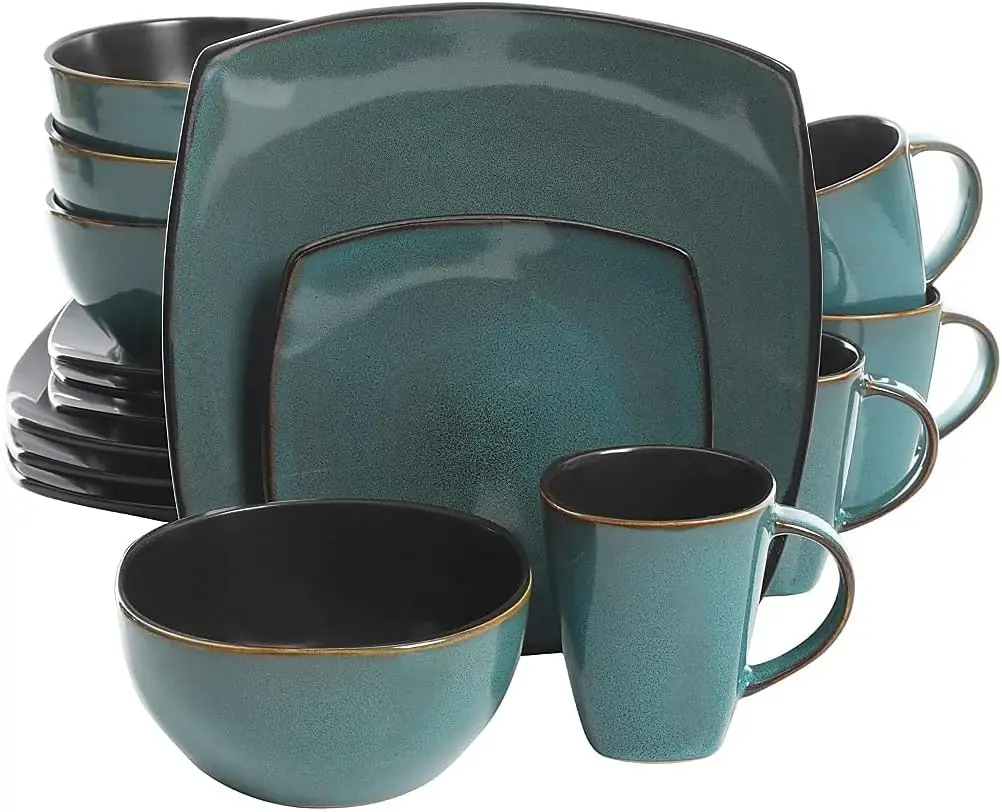
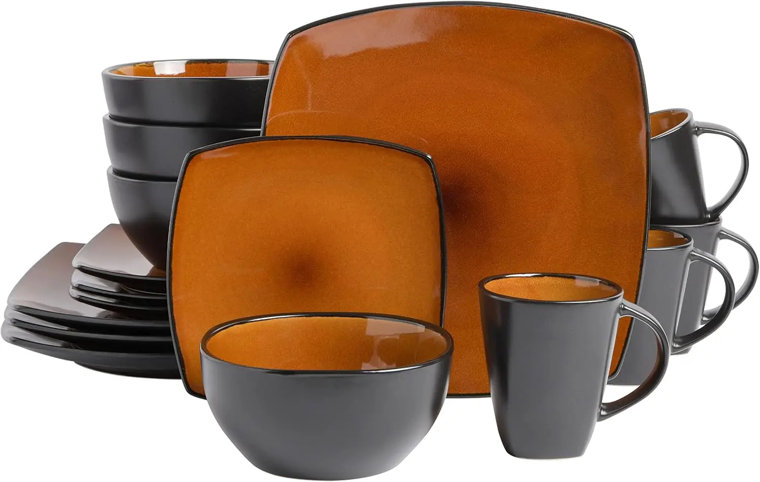
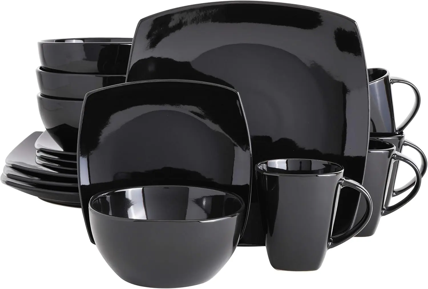
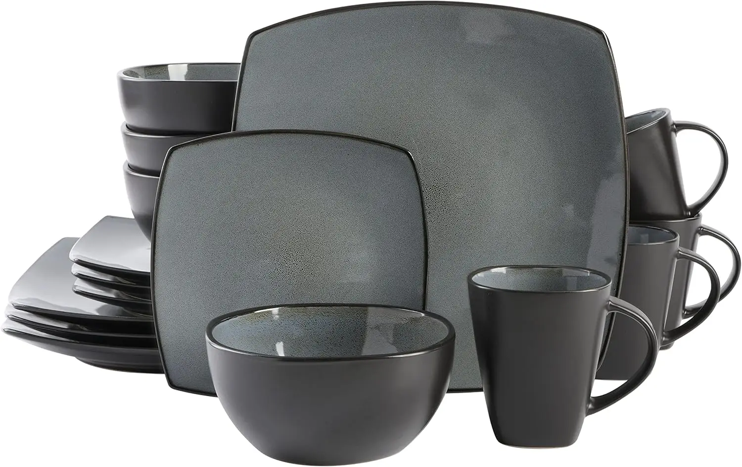
- WHAT’S IN THE BOX: Service for 4 that includes 4 of each of the following: 11″ Dinner Plates, 7.5″ Dessert Plates, 6″ (31 OZ) Cereal Bowls and 12 OZ Mugs
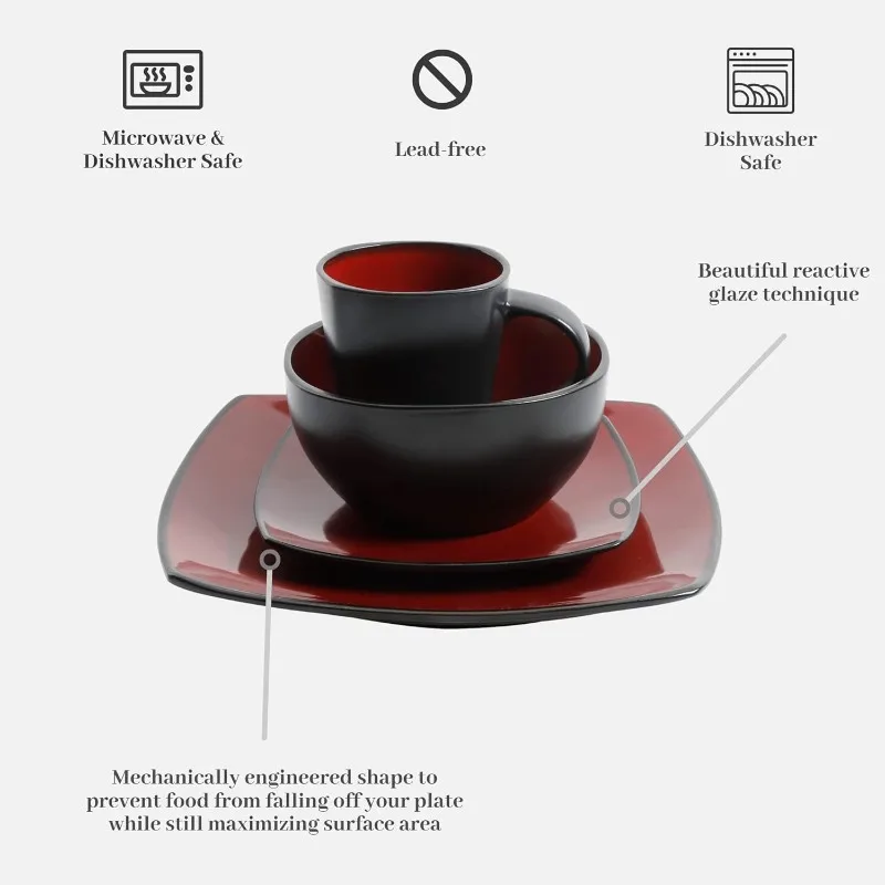
- CARE INSTRUCTIONS: beautiful red and black dishes that are also dishwasher and microwave safe
- STONEWARE/DOUBLE REACTIVE GLAZE: reactive refers to a technique how multiple colors within the glaze react together to create a dreamlike, vibrant quality to the colors and hues. Due to the reactive nature of the glaze, each stoneware piece is unique. The high firing temperature, thick build, and mix of all-natural clays, makes stoneware an incredibly durable material.
- CONTEMPORARY DESIGN: artisanal reactive glaze featuring natural organic hues creating a modern elegance to the dinnerware set. The durable stoneware and reactive glaze make these sets difficult to scratch and break
- PERFECT FOR GIFTING: beautiful colors, trend forward design, and the ability to mix and match sets makes this collection the perfect gift and holiday present for your friends and relatives. This collection is particularly popular as a wedding gift for couple’s moving into a new home together.


#productDescription h3 {
margin: 0.75em 0px 0.375em -1px;
}
.aplus-v2 .apm-brand-story-carousel-container {
position: relative;
}
.aplus-v2 .apm-brand-story-carousel-hero-container,
.aplus-v2 .apm-brand-story-carousel-hero-container > div {
position: absolute;
width: 100%;
}
/*
Ensuring the carousel takes only the space it needs.
The sizes need to be set again on the absolutely positioned elements so they can take up space.
*/
.aplus-v2 .apm-brand-story-carousel-container,
.aplus-v2 .apm-brand-story-carousel-hero-container {
height: 625px;
width: 100%;
max-width: 1464px;
margin-left: auto;
margin-right: auto;
overflow: hidden;
}
.aplus-v2 .apm-brand-story-carousel-hero-container,
.aplus-v2 .apm-brand-story-carousel-hero-container > div {
height: 625px;
}
.aplus-v2 .apm-brand-story-carousel.a-carousel-container {
padding: 0px;
}
/*
This centers the carousel vertically on top of the hero image container and after the logo area (125px).
Margin-top = (heroHeight – cardHeight – logoAreaHeight) / 2 + logoAreaHeight
*/
.aplus-v2 .apm-brand-story-carousel .a-carousel-row-inner {
margin-top: 149px;
}
/*
Cards need to have a width set, otherwise they default to 50px or so.
All cards must have the same width. The carousel will resize itself so all cards take the width of the largest card.
The left margin is for leaving a space between each card.
*/
.aplus-v2 .apm-brand-story-carousel .a-carousel-card {
width: 362px;
margin-left: 30px !important;
}
/* styling the navigation buttons so they are taller, flush with the sides, and have a clean white background */
.aplus-v2 .apm-brand-story-carousel .a-carousel-col.a-carousel-left,
.aplus-v2 .apm-brand-story-carousel .a-carousel-col.a-carousel-right {
padding: 0px;
}
.aplus-v2 .apm-brand-story-carousel .a-carousel-col.a-carousel-left .a-button-image,
.aplus-v2 .apm-brand-story-carousel .a-carousel-col.a-carousel-right .a-button-image {
border: none;
margin: 0px;
}
.aplus-v2 .apm-brand-story-carousel .a-carousel-col.a-carousel-left .a-button-image .a-button-inner,
.aplus-v2 .apm-brand-story-carousel .a-carousel-col.a-carousel-right .a-button-image .a-button-inner {
background: #fff;
padding: 20px 6px;
}
.aplus-v2 .apm-brand-story-carousel .a-carousel-col.a-carousel-left .a-button-image .a-button-inner {
border-radius: 0px 4px 4px 0px;
}
.aplus-v2 .apm-brand-story-carousel .a-carousel-col.a-carousel-right .a-button-image .a-button-inner {
border-radius: 4px 0px 0px 4px;
}
.aplus-v2 .aplus-review-right-padding {
padding-right: 0.1rem;
}
.aplus-v2 .aplus-review-right-padding {
padding-right: 0.1rem;
}
.aplus-v2 .aplus-review-right-padding {
padding-right: 0.1rem;
}
.aplus-v2 .aplus-review-right-padding {
padding-right: 0.1rem;
}
.aplus-v2 .aplus-review-right-padding {
padding-right: 0.1rem;
}
.aplus-v2 .aplus-review-right-padding {
padding-right: 0.1rem;
}
.aplus-v2 .aplus-review-right-padding {
padding-right: 0.1rem;
}
.aplus-v2 .aplus-review-right-padding {
padding-right: 0.1rem;
}
.aplus-v2 .aplus-review-right-padding {
padding-right: 0.1rem;
}
.aplus-v2 .aplus-review-right-padding {
padding-right: 0.1rem;
}
.aplus-v2 .aplus-review-right-padding {
padding-right: 0.1rem;
}
.aplus-v2 .aplus-review-right-padding {
padding-right: 0.1rem;
}
.aplus-v2 .aplus-review-right-padding {
padding-right: 0.1rem;
}
.aplus-v2 .aplus-review-right-padding {
padding-right: 0.1rem;
}
.aplus-v2 .aplus-review-right-padding {
padding-right: 0.1rem;
}
.aplus-v2 .aplus-review-right-padding {
padding-right: 0.1rem;
}
.aplus-v2 .aplus-review-right-padding {
padding-right: 0.1rem;
}
.aplus-v2 .aplus-review-right-padding {
padding-right: 0.1rem;
}
.aplus-v2 .aplus-review-right-padding {
padding-right: 0.1rem;
}
.aplus-v2 .aplus-review-right-padding {
padding-right: 0.1rem;
}
.aplus-v2 .aplus-review-right-padding {
padding-right: 0.1rem;
}
.aplus-v2 .aplus-review-right-padding {
padding-right: 0.1rem;
}
.aplus-v2 .aplus-review-right-padding {
padding-right: 0.1rem;
}
.aplus-v2 .aplus-review-right-padding {
padding-right: 0.1rem;
}
Reviews
There are no reviews yet.